
IMRNonprofit · Rebrand
Imagine Reading
A clear first step for parents, set in type made for reading.
- Sector
- Dyslexia nonprofit, upstate and rural New York
- Project
- Rebrand
- What we did
- Brand Identity, Messaging, Content, Design, Websites, Development
- Built on
- Astro, Cloudflare, Bloomerang
The result
100Speed score on desktop, with best practices and SEO at 100 tooLIGHTHOUSE · OCT 2026
- 19
- Questions parents ask, answered in plain wordsLive site
- 5
- Stages in the First Steps guide, with signs for four age groupsLive site
A dyslexia nonprofit. A refreshed identity and a new website set in Lexend, a typeface designed for easier reading.
The situation.
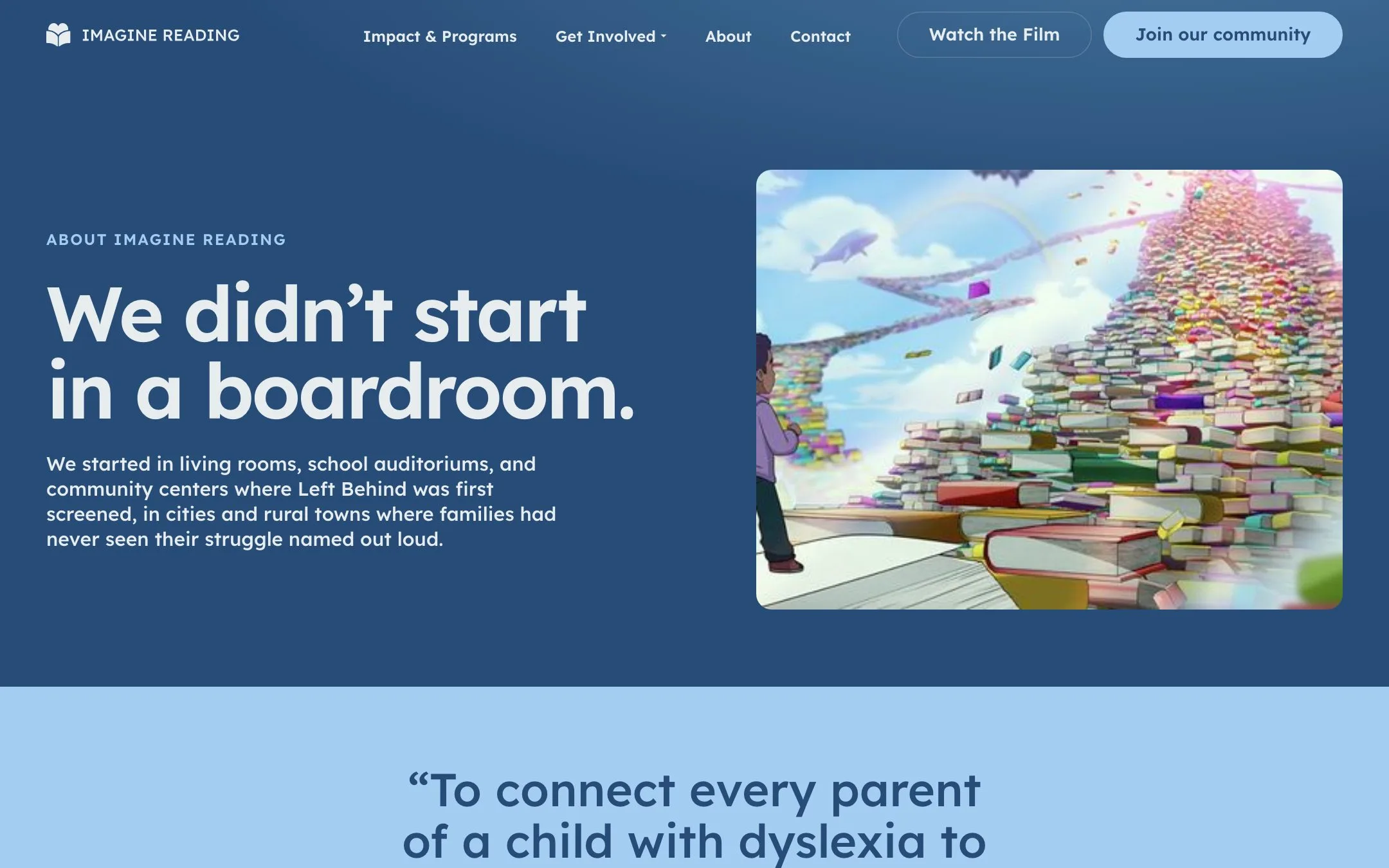
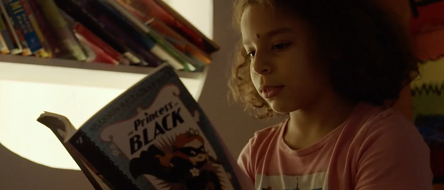
A nonprofit born from a documentary about dyslexia, on a site its founders did not love.
The brief.
Dyslexia runs in families, so the site has to be easy to read for parents too.
Type that does the work.
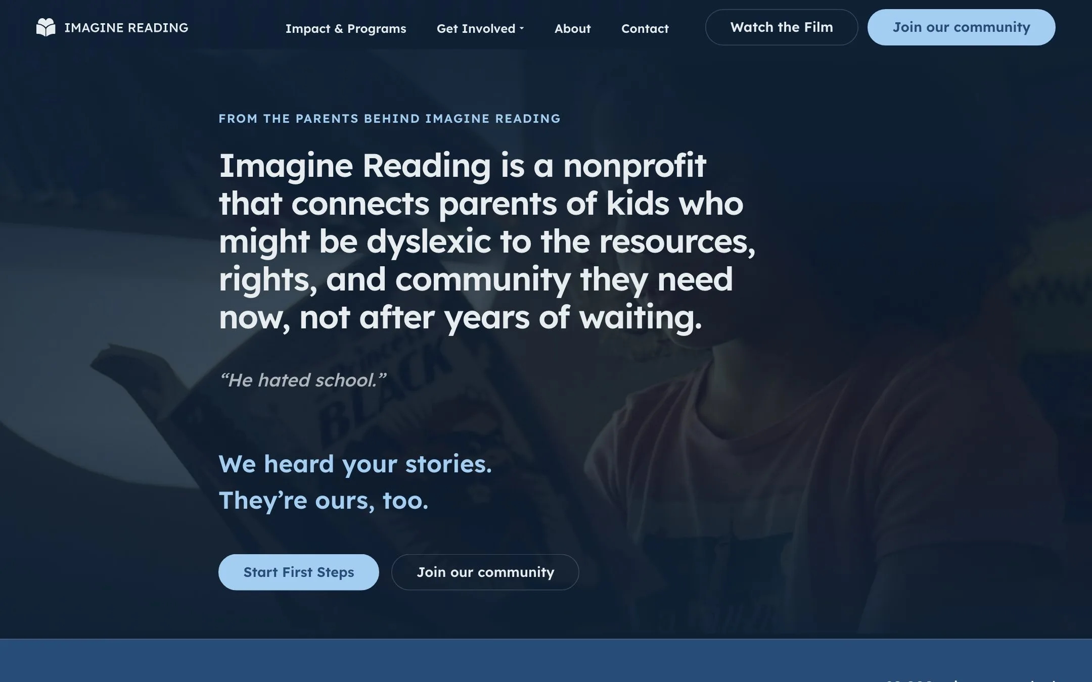
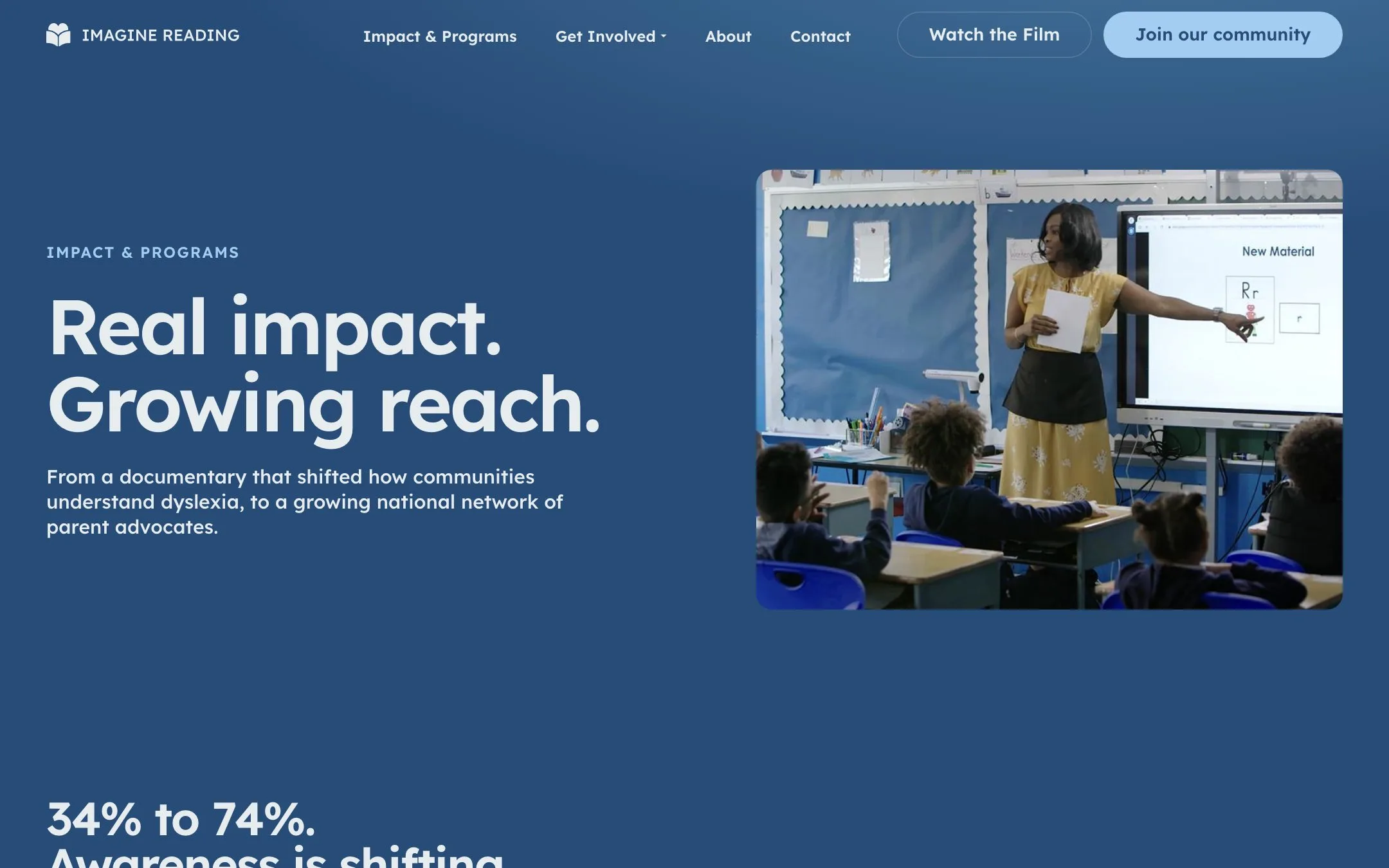
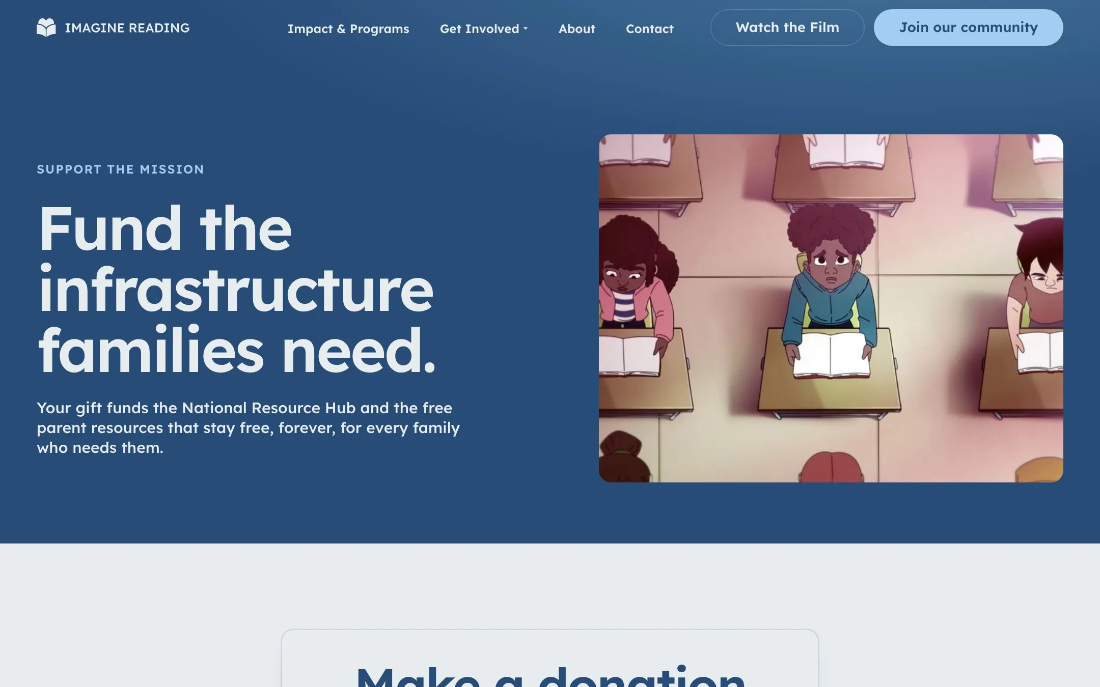
Dyslexia is hereditary, so many parents reading the site may be dyslexic too. We set everything in Lexend, a typeface designed for easier reading, with color contrast at the highest accessibility level.
Three doors, one step each.
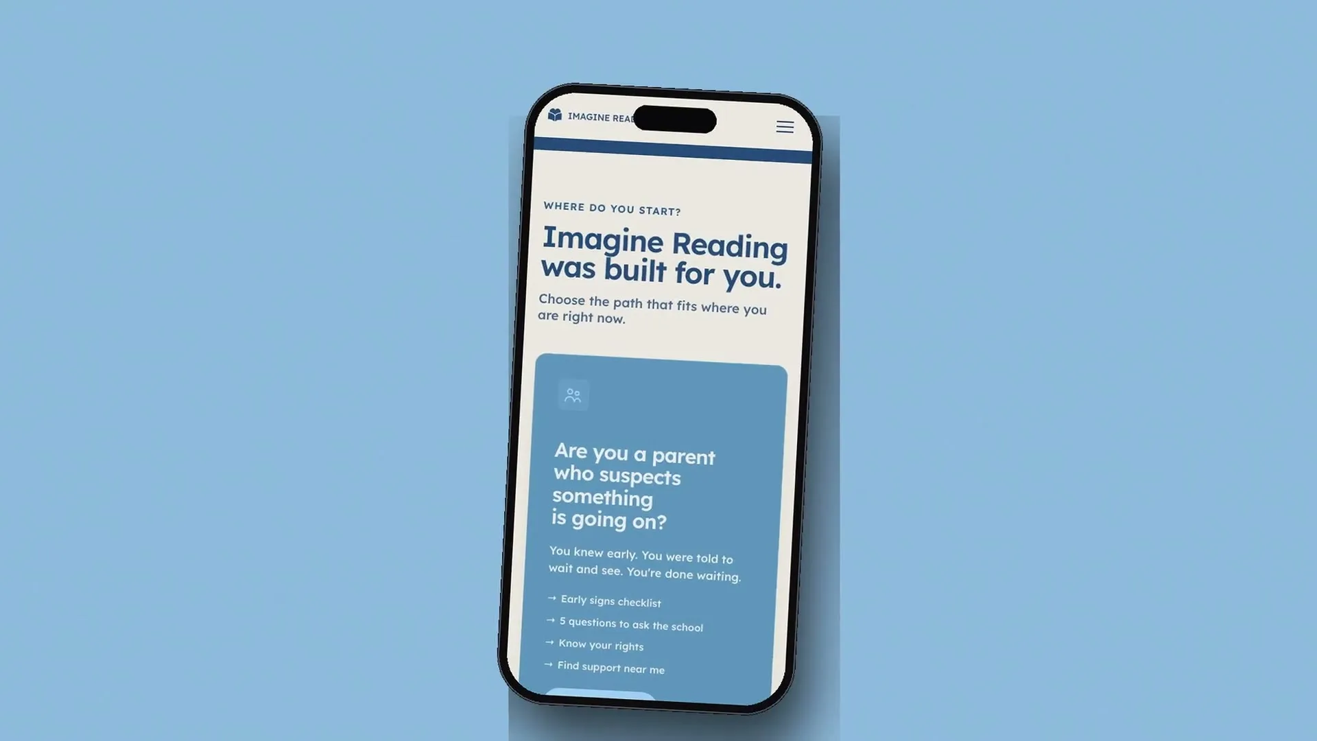
Parents, supporters and advocates each get their own path from the home page, so nobody has to read past what is not for them.
A guide, not a brochure.
First Steps walks a parent from the first signs, by their child’s age, to the questions to ask the school, the rights most families are never told about, and a letter they can send that day.
Every sign-up counted.
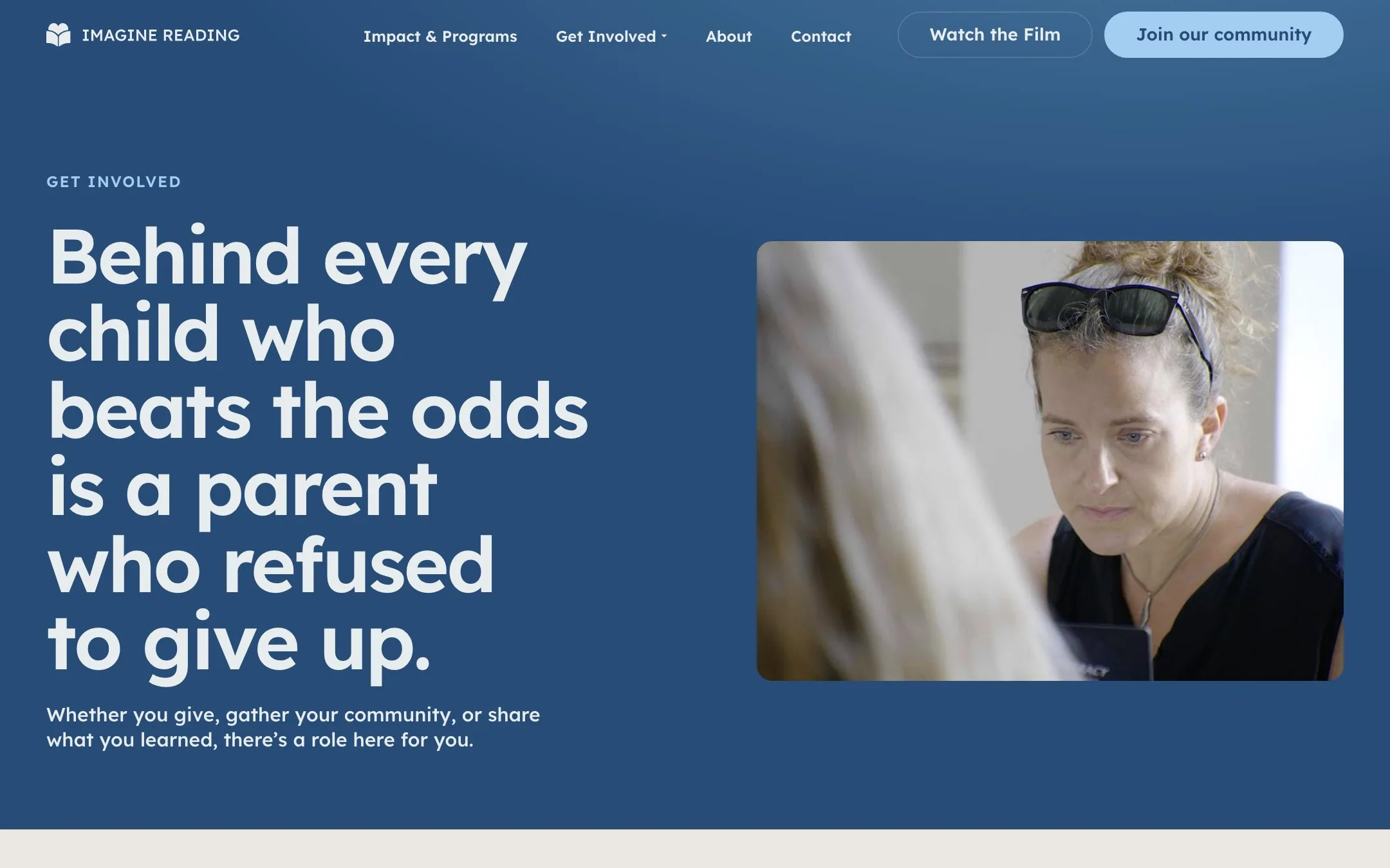
The community form takes about a minute on a phone. Each answer lands in the nonprofit’s CRM, and a short barriers checklist turns sign-ups into figures it can share with donors and lawmakers.



Running a business like Imagine Reading?
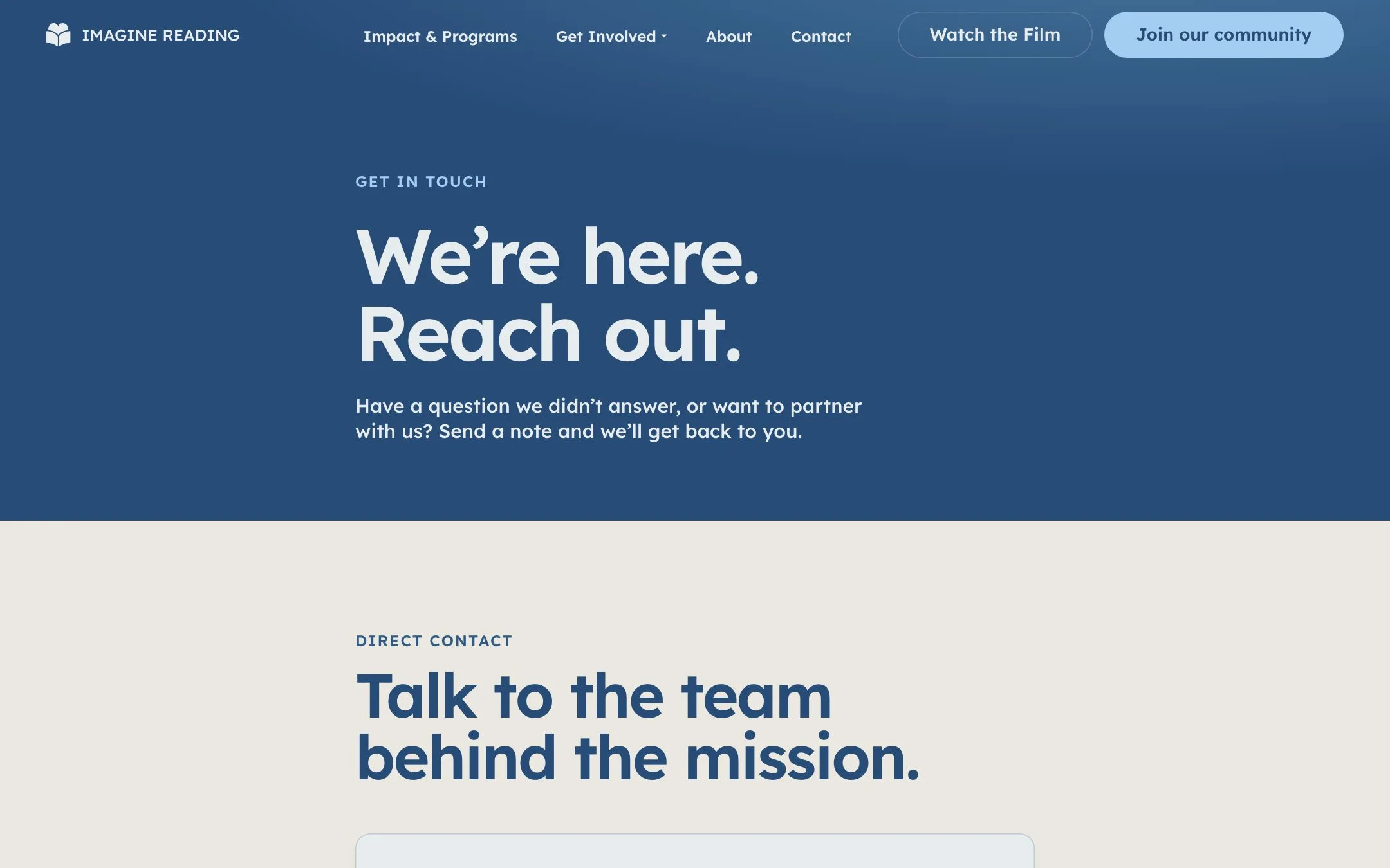
Tell us where you are and where you want to go. It starts with a conversation, then your Flight Plan in writing.
Copper Faucet
Packaging that sells at the market, and a store that brings regulars back.